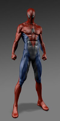
Concept art for The Amazing Spider-Man's suit
Early concept art has been surfacing for Spider-Man's suit for The Amazing Spider-Man and some of them have some very interesting takes on how the wall crawler should have looked. The pieces were created by concept artists Eddie Yang and Aaron Sims. Take a look below and see what you think may have worked or what you are glad was dropped to the art room floor.
I really enjoy Eddie Yang's designed and really like design 1 and 4 but I feel the eyes on the suits take away from the Spider-Man feel. With proper eyes I feel those two could have looked really cool. Also, design #4 has a Spider-Man 2099 feel with the "web cape".
Aaron Sims has some interesting designs as well. Although his first design misses the mark since it's way too similar to Raimi's Spider-Man and looks like a little kid made it (and is wearing it). His other designs are very cool though. I particularly like #4 with the straight blue and webbed red with the large spider logo.
Which among these concepts are your favorite?
Concepts created by Eddie Yang:
Concepts created by Aaron Sims:
Source: Comic Book Movie - Eddie Yang
Source: Comic Book Movie - Aaron Sims


My favorite superhero all the time! Yay, Spiderman! :D
ReplyDelete